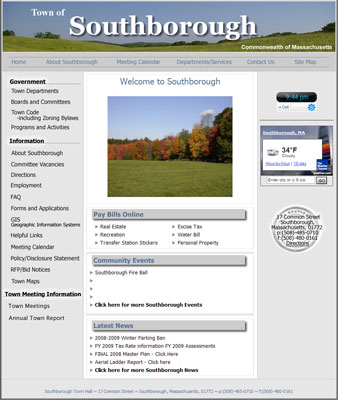
I visit the town website a couple times a week looking for information, and I have to admit I’ve never enjoyed the experience. But as of yesterday all that changed!
A new Southborough town website was just launched. The new site is a huge improvement aesthetically speaking — nice photos of the town on the home page and a more pleasant color scheme. But it’s also much more functional.
The links to pay bills online are right on the front page, and there’s a section for the latest events and news. It much less cluttered, so it’s easier to find the links you’re looking for. You’ll notice some pages, like the Town Meeting ones, are blank with “coming soon” messages, but presumably they are in fact coming soon.
My one criticism — aside from the fact that there isn’t a link to the My Southborough blog on the Helpful Links page — is that text links aren’t formatted to look like links. They just look like regular text, so it’s impossible to tell at a glance what is a link and what isn’t.
Pop over to the new site and take a look, and then share your thoughts in the comments. Do you like the new design? Is it easier to find the resources you care about? What other things would you like to see on the site?
02/04 Update: Assistant Town Administrator Vanessa Hale kindly added My Southborough to the Helpful Links page. Thanks, Vanessa!


