I went to the public meeting on Southborough’s community character last week expecting to hear a lot of adjectives that describe what the town of Southborough is all about. Instead I got a whole lot of photos.
And turns out photos can be much more revealing than adjectives.
About two dozen residents showed up for the meeting, part of a series designed to inform the zoning bylaw review project. The evening started with a group discussion on topics like Transfer of Development Rights (I missed this discussion so I have no idea what that means), a no-disturb buffer to help preserve scenic roads, and shared septic systems to encourage development where it might otherwise not be possible.
But the evening really got going when we were asked to participate in a visual preferences survey. The survey consisted of photos of 60 different buildings, ranging from single family homes to retail to commercial developments. Each participant had a scorecard and was asked to rate the buildings based on how positively or negatively they felt about them.
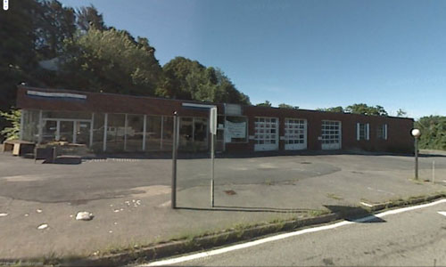
When we had rated all the buildings, we discussed what we liked and what we didn’t. Some were easy to agree on. The old Volvo dealership that used to be at the corner of Route 9 and Oak Hill Road was universally panned. (Photo from Google Maps).

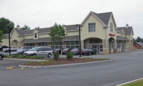
But there was much less agreement about the Walgreens building that took its place, with comments ranging from “gorgeous” to “cookie-cutter.” (I won’t tell you which way I swayed.)

Finding the trends
The Zoning Advisory Committee will use the data from the visual preferences survey to look for trends in what appeals to residents and what doesn’t. I don’t have the data, but from the disucssion alone I was able to pick out some clear themes.
Residents preferred business village districts with smaller-scale buildings, welcoming landscaping (lots of flowers), and approaches that were pedestrian-friendly.
When it came to single-family homes, the ones that won out had mature landscaping and treescapes, and evoked a sense of connectedness with the neighborhood or community.
And in non-village retail and commercial buildings, it was all about height and parking. Residents liked office buildings that weren’t too tall or that employed architectural strategies to diminish the impact of height. They also prefered parking to be out of sight in commercial and retail developments, either behind the building or underground.
What about you? Are there examples of buildings or developments in Southborough that you either really like or really don’t like? Share your opinions in the comments.
For more on the zoning review project, click here.


I agree with the ideas that were presented thru your article but here’s one pet peeve that I have regarding visual impact for the town of Southborough….How about an empty lot on a busy corner – welcoming EVERYONE into our lovely little village….it really says something about what kind of first impression we want people to have. I pass that lot more than 3 times a day and I cringe every time. I know it’s better than the beat up old gas station that was there but let’s try to work with the owner of the property and get something going with that – even just to keep it mowed and remove that fence would be better.