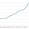
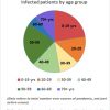
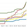
Above: Positive and active case figures keep climbing in Southborough this fall. (Click to enlarge)
The Town updated its Covid cases this morning with six new patients since yesterday.
On November 28th, the number of active Covid cases in Southborough passed the previous peaks in May and October of 13 cases. Since then, it has continued to climb. There are now over 30 active cases in town. The number of cases confirmed in town since the start of the pandemic is now at 142. Over 35% of those were confirmed in the last 30 days alone.
In the past 14 days, 40 cases have been confirmed, 26 in the last week. New cases again cut across multiple age groups. Below are more of my updated graphs:
The state shifted the Town into the red/high risk category in last night’s weekly report. (It is the first time since the state changed its metrics in early November to significantly increase the number of cases in town required to trigger the label.)
The new designation appears to be based on 35 positive results from tests taken between November 15th -28th. Framingham is still designated red. All of our town’s other direct neighbors are classified yellow. That includes Northborough, our school district partner, even though their numbers seem worse.
Southborough’s Average Daily Incidence Rate per 100,000 was 24.4 vs Northborough’s 33.2. (In fact, all of our direct neighbors have a higher Daily Incidence Rate than us.) Northborough had 76 cases confirmed in the past two weeks. 82 cases are listed as active in the town as of yesterday afternoon. But Northborough’s population puts it in a different metrics category for how MassDPH calculates risk.
This week’s updates from the district indicates five students/staff across NSBORO schools were tested positive since the last Dashboard update on Sunday. There have still been no cases linked to in-person contact in the schools.
Restored (12/11/20 8:27 am): Somehow, I accidentally deleted this story. (I have no idea how and I’m not sure when. I discovered it was missing this morning and restored it.)


You wrote, “All of our town’s other direct neighbors are classified yellow. That includes Northborough, our school district partner, even though their numbers seem worse.”
The numbers in Southborough are worse for the past two weeks compared to the surrounding towns. Our total count is 134 and for the past two weeks we had 33 cases, thus representing approximately 25% of the total cases. For Northborough, the total count is 419 and for the past two weeks 63 cases, thus representing approximately 15% of the cases.
I was referring to the state’s analysis of the daily case rate based on a town’s population. Their figures are higher for that. To me, we clearly should be in the red. I’m just puzzled why those communities aren’t. The argument that their numbers are better because they had more cases in the past doesn’t make logical sense to me.
The reason the other towns are still yellow is a population issue. As we are under 10K we have more stringent rules/calculations. The issue is that at such a small population even a couple of families getting sick would move the needle. The state has different calculations under 10K under 50K and under 100K I believe.
The problems are that for 10K town, to be yellow we need fewer than 25 cases in 2 weeks. 25/10,000 is 0.25%. As soon as we have 25 in 14days we go to red.
10-50K needs to have a smaller percentage of new infections but it ALSO much have a greater than 5% positivity/testing rate. That is actually very high. Sobro only had 2.14% positivity.
So Nobro might have plenty of cases but as long as the positivity rate stays below 5% they will not go into red zone.
Nobro new cases were ~40% higher per capita but their positivity was 3.72% which is well below the red line.
Marlbro is higher per capita than Nobro but 4.78% positivity rate, so they also stay in yellow. They will not be yellow next week, there is no way. They will go over the 5% I am sure.
Framingham is similar per capita to Marlbro, but the are 5.04% so they went red this week.
10-50K to
When I said that I was puzzled, it was poor wording. I should have said surprised.
I understood, and referred to in the post, that the population size puts towns in different metrics categories. When the change was made to metrics in early November, it made it harder for our town to go red. I didn’t realize that changes to the categories for neighboring towns could mean that they could have a higher infection rate while staying at a lower risk rating than us. I’m not puzzled about why neighboring towns are in yellow. I’m a little puzzled about the thinking behind the metrics categories.